
How We Designed Winnetka: Interior
BEHIND THE SCENES
Over the past year, our Winnetka cafe site has undergone a radical transformation visible from the street, but what many may not realize is that the interior work began long before the exterior did, and after many long months, the work is finally done and we are open! Over the past 2.5+ years that we’ve been working on this project, I’ve been asked about the design so many times, especially because it is an old retro gas station. A lot of people have been curious about how we arrived at the aesthetic we have.
Design inspiration

In this photo, I’m describing to the team the way this corner will transform into huge picture windows with wraparound bar height seating.
In most adaptive reuse projects, there is a sense of repurposing that is really attractive—walking into a place with an obvious history is fun. My brother, for instance, used to live in an old factory-turned-artis-lofts and it was enchanting to walk the halls and envision its prior use juxtaposed with modern living. Although we were eager to maintain the structure and, where possible, material of the original building, the aim of this project wasn’t necessarily to call back its initial purpose (we aren’t a gas-station-themed coffee shop, after all) but rather to employ a design that makes you feel as though this is what the building was always meant to be.
Layout and beginning build-out
Long before we even began build-out, we had a competitive proposal process that eventually landed us as the Village Council’s top pick. Before we even put together a presentation, however, I wanted to know that the building was viable for what we wanted to do: that we would have enough space to operate a cafe in a small footprint.
From the get-go, this building offered significant challenges because of its size. The whole structure is about 100 sqft less than our Highwood Cafe—and unlike in Highwood, Winnetka's square footage includes the utilities and bathrooms—so it wasn’t immediately obvious that we could thrive in that space. In those early weeks, I poured over different configurations that would allow the most seating while maintaining a good traffic flow and landed on a winner relatively quickly. Having that floor plan in mind was huge when we finally got the keys and began our work because it gave us a vision to cling to as we began the build-out.

We removed the existing office wall in order to open up the building into one larger area.
Looking at the cafe now it would be difficult to believe where we started. When we got the keys, the interior was filled with decades of dirt and grime and general disrepair before we began our work. We knew from the get-go that we were getting into a very difficult project, but believed in the potential from the first day.
Our first task when we acquired the building was to remove all the interior panels that lined every square inch of the walls and ceilings. Our aim was to reuse them if possible, so we chose to dismantle them ourselves, working as carefully as we could in the circumstances. Removing them was a painstaking process that took weeks of grueling days spent in the dead of winter getting covered in dust and debris. In the end, we could only use four of them in our final design—here’s your cue to look for them on your next visit! Thankfully, we salvaged all of the exterior panels original to the building and found other ways to make the inside and outside feel congruent.
Design inspirations
The design inspiration began with the outside (read more about that here). Pulling up old photos of Texaco Gas Stations was hugely inspirational. Interestingly, so many of those photos were set in the desert, and that brought to mind the idea of an oasis, which really resonated with what I knew of this place already. The Indian Hill district doesn’t have a lot of available space for gathering and community, and it seemed obvious to us from the beginning that that was something that residents were looking for. That is also central to our desire as a business—to offer a place for genuine connection and community is extremely important to us. The idea of a desert oasis was both aesthetically and intellectually inspiring as we sought for a direction to make this space come alive.
We drew further inspiration from the era in which the building was erected and the shape and characteristics of the building and lot together. Since the aim was always to make the space feel like it was always meant to be this way, we wanted to choose fixtures and finishes that could almost seem original. This informed many design decisions along the way. Generally, if we were stuck between two options, the tie-break was always which one was more era-appropriate.
Design Details
These two main design ideals guided a thousand smaller design decisions along the way that eventually added up to what you see in the cafe today. (invitation to look at the photos below)

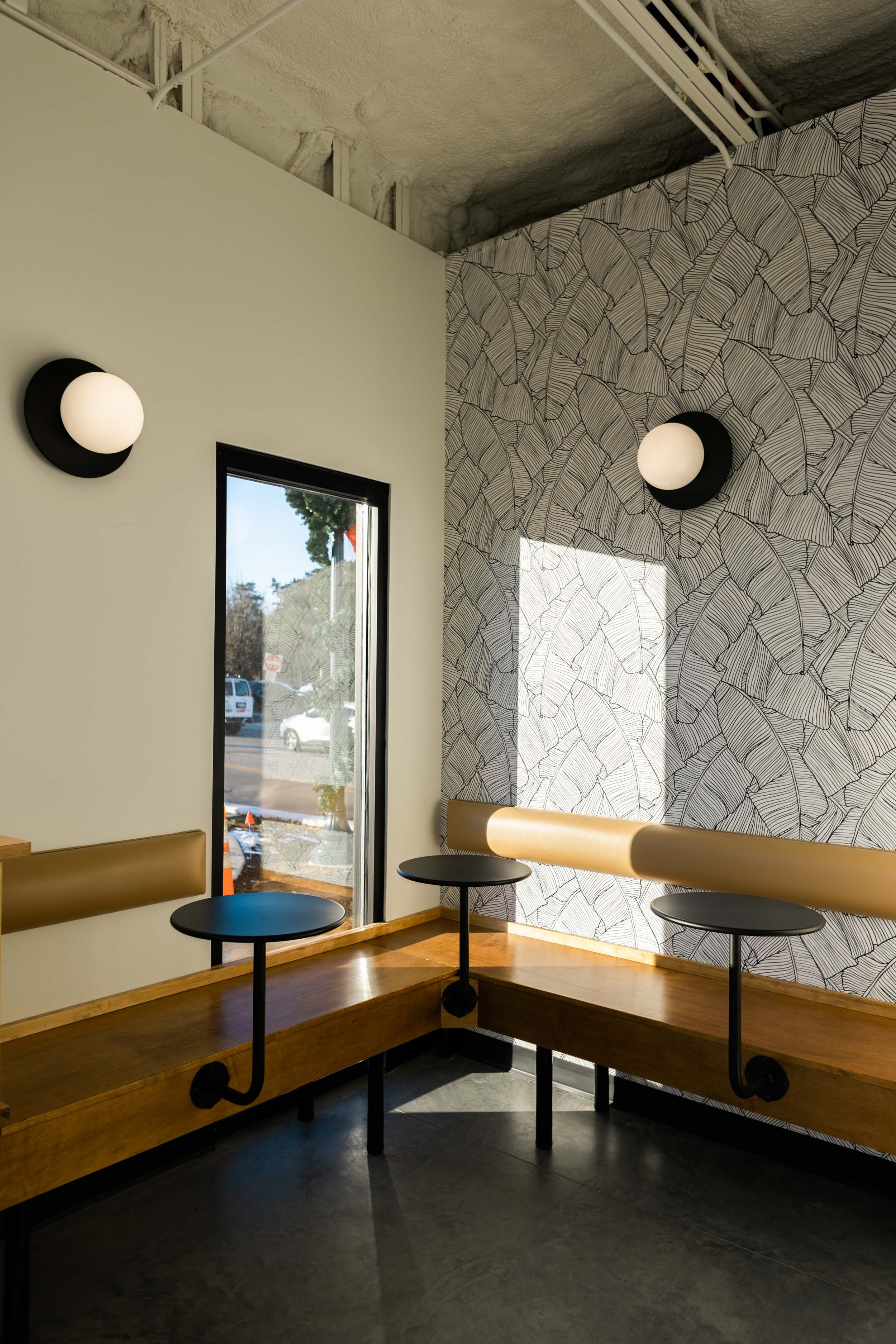
We preserved all original window and door openings, replacing everything with large glass panes to open the space and encourage bright sunlight to permeate the space. With all of that natural light, we knew we could add lots of arid plants to encourage the feel of a desert oasis.

Almost all of our seating was custom-designed wood pieces, so getting the right wood tone was important. We knew we wanted to use lighter wood and other natural textures that would brighten up the space even more. We ended up with a custom-blend stain that we felt struck just the right cord of light yet robust. Its tone holds up to the intense sunlight without getting washed out but isn’t dark enough to break up the space too much.

We made use of horizontal lines in many places throughout the space which helps widen the feel. Behind bar we chose to put three shelves across the whole wall which is a repeated pattern from the three blue stripes around the exterior fascia.
Before and after
We all love to see the before and after photos. Over a year of build-out later, the side-by-side is almost hard to believe. We are so thankful that so many of our original intentions were able to come to light in the end.
Bathroom tile
The two old bathrooms—which had the classic exterior entrance of retro gas stations—were tiled with this fun 1’ x 1’ mint green tile (left) that was the single pop of anything pleasant on the ground in the whole space when we got in. When designing the new bathrooms, we opted for 1’ x 1’ square tiles to mimic this design, although they are—unsurprisingly—not mint green.


cozy corner
From the very beginning, we loved the idea of transforming the whole original entrance to a wrap-around bar top that meats bench seating in a cozy corner area. The window behind the bench shown was the original exterior door to the bathroom.

transforming original panels
We loved the two-toned panel look inside the building, which was also original to the exterior. We knew that we wanted to use long horizontal lines to achieve a similar look as well. We became really excited about the idea of doing something on the bar that would call back this design. Using 2’ x 2’ blue tile on the bottom and the original panels on the top, we created a certain amount of cohesiveness with the exterior.


Process photos
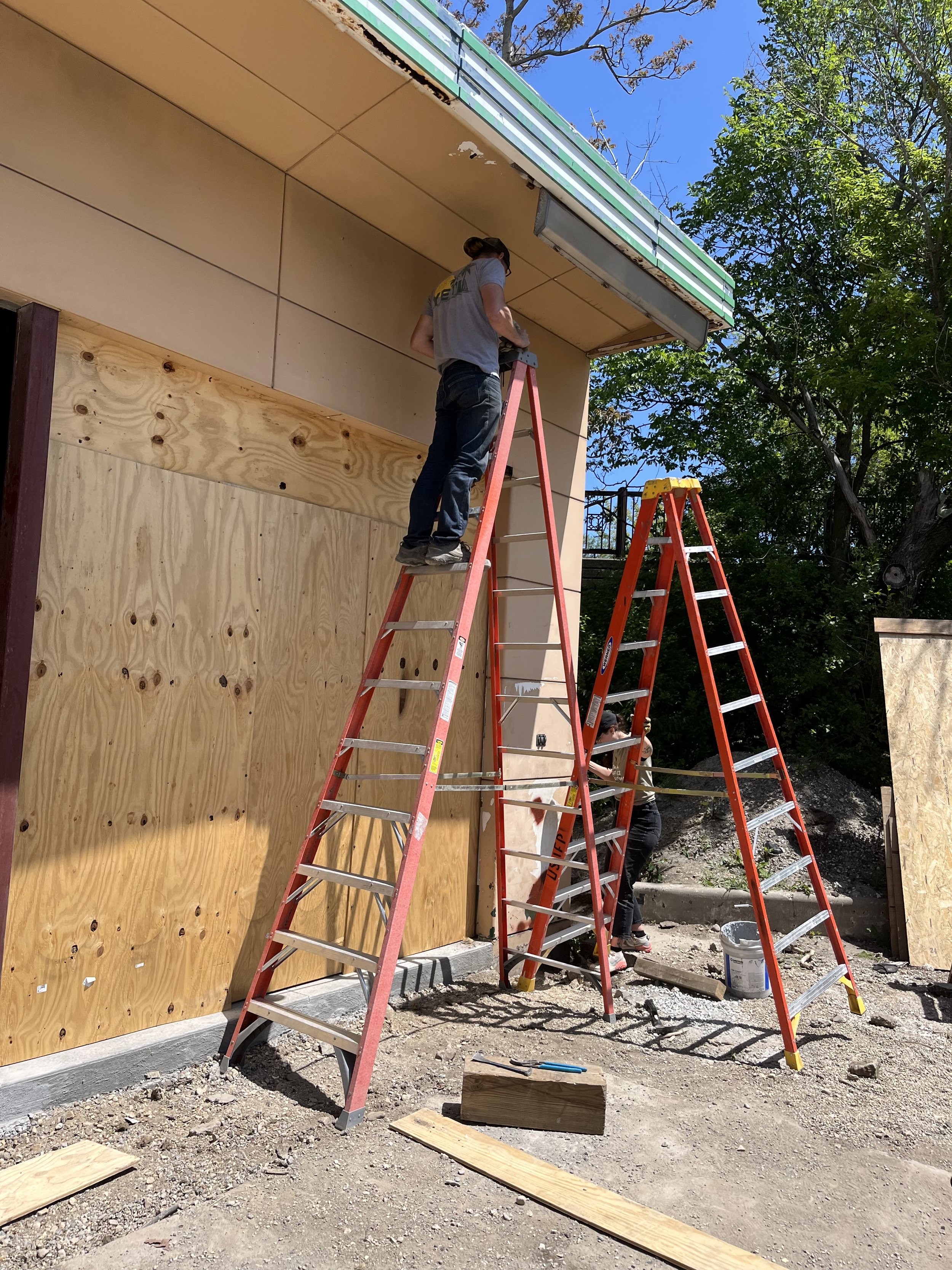
There is so much to say about this process, but in the end, it is the photos that say the most. See below for a further look into the transformation. From the odds and ends to the big demolition, these photos helped us measure our progress along the way and keep our spirits high.

A collection of stickers were on the back wall of the building. That was one of many little personal items left behind when we got in, reminding us of the many people who had used the building before us.

Demo began with removing everything existing in the building, which turned out to be more difficult than one would assume. Everything there was bolted into the walls with decades-old screws making for a difficult job.

Every day was a different challenge: like how to remove an oil and gas dispenser from the ceiling. As cliche as it sounds, we found that when we worked together we could usually come up with solutions that made things easier than we expected.

After removing the panels we organized them by condition and size and saved as many as we could for reuse.

Early on in the process we found that we needed to excavate the whole floor. Although we weren’t originally anticiapting a project that would bring us down to the studs and the gravel, we found ourselves working literally from the ground up.

We had to remove many of the doors and windows to remove the interior interlocking panels. The building (amazingly) started looking worse before it looked better.

Seeing the walls go up makes such a transformation in the space as we finally get to see things take shape and look like a real project.
A surprisingly difficult challenge was removing the old exterior soffit lights. These took every bit of strength from Ryan and me together and spanned two full days.

Drywall and paint make perhaps the biggest difference of all as we could finally say goodbye to seeing the studs and really envision our future cafe.
In the end, we are exceedingly grateful that we have had the opportunity to do this project and that it has turned out well. The best part of being open so far has seen so many people turn up and be excited about revitalizing the corner and providing a much-needed oasis in the Indian Hill district for the community to gather. We hope that we can continue to serve in this capacity for decades to come.

Joanna Tong
Joanna is one of the owners here at Tala, heading up Operations and Strategy. Born and raised in Minnesota, she moved to Illinois in 2014 with no intention of staying long-term until the idea of Tala came to light. When not in the office or the cafe, you can find her in a forest preserve enjoying the outdoors or at home hanging out with her cat.